Comparing Water Vapor Channel Brightness Values in Clear Skies
SIFT display of 6.2 µm imagery from AHI, 0000 14 March 2017 (Click to enlarge)
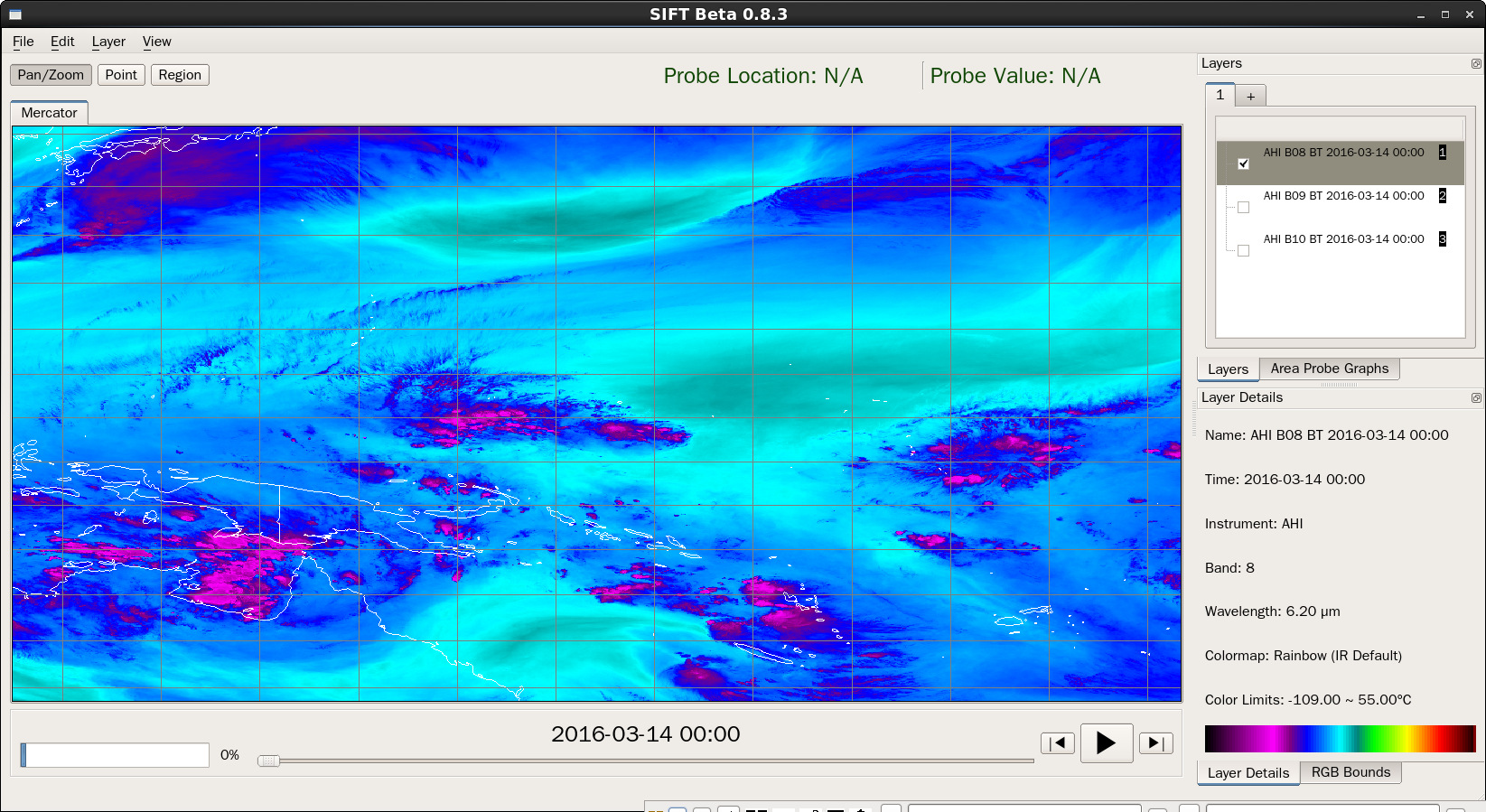
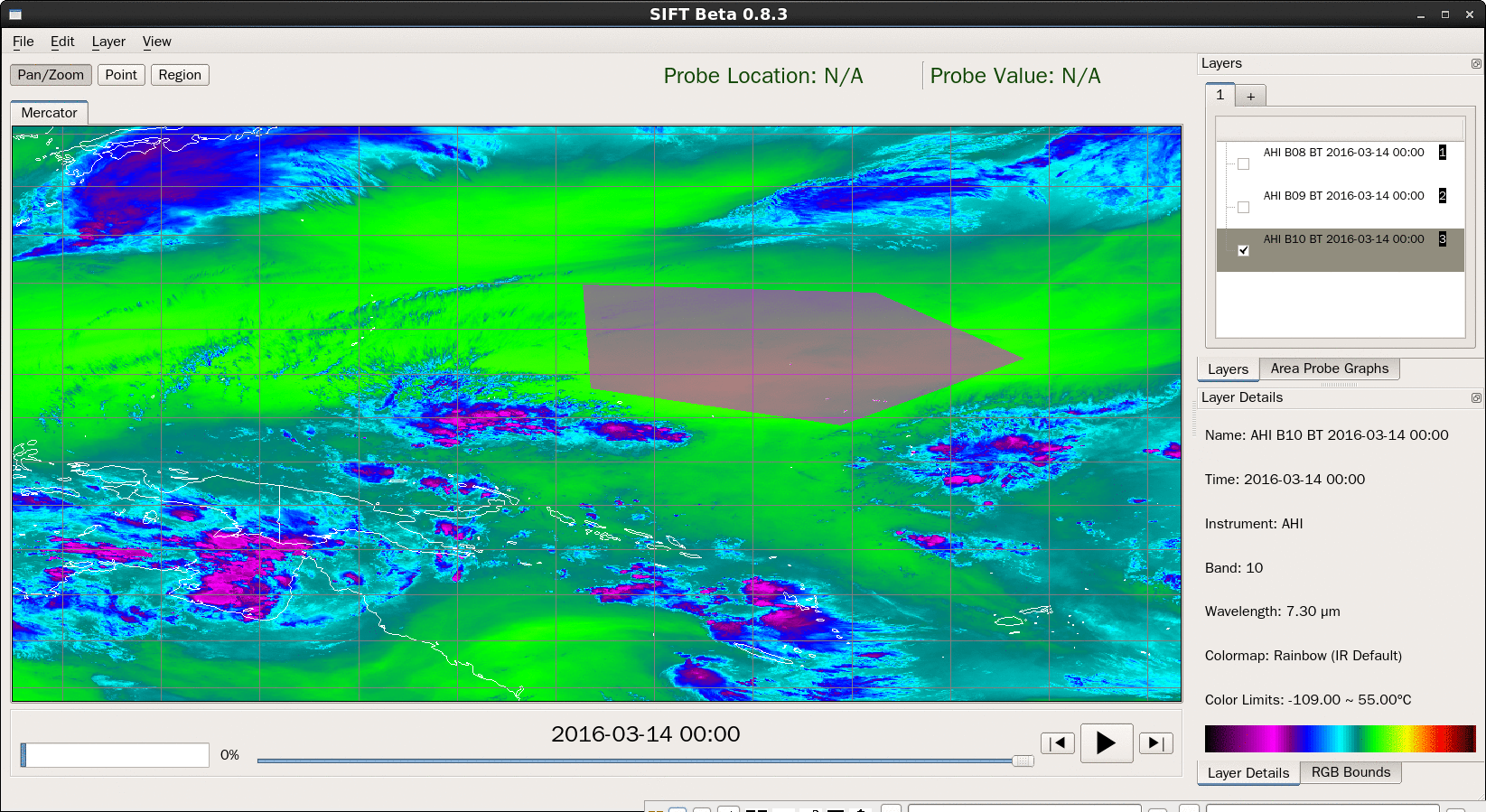
The image above is the 6.2 µm water vapor channel from AHI on 14 March 2016 at 0000 UTC. (Band 8). Bands 9 and 10 have been loaded as well, and are listed in the ‘Layers’ Window. SIFT allows a user to quickly compare brightness temperatures between AHI or ABI bands. A simple way to is toggle quickly through the bands using the down arrow on the keyboard. That is shown below. The same color scale is used for all three bands and there are obvious differences between bands.
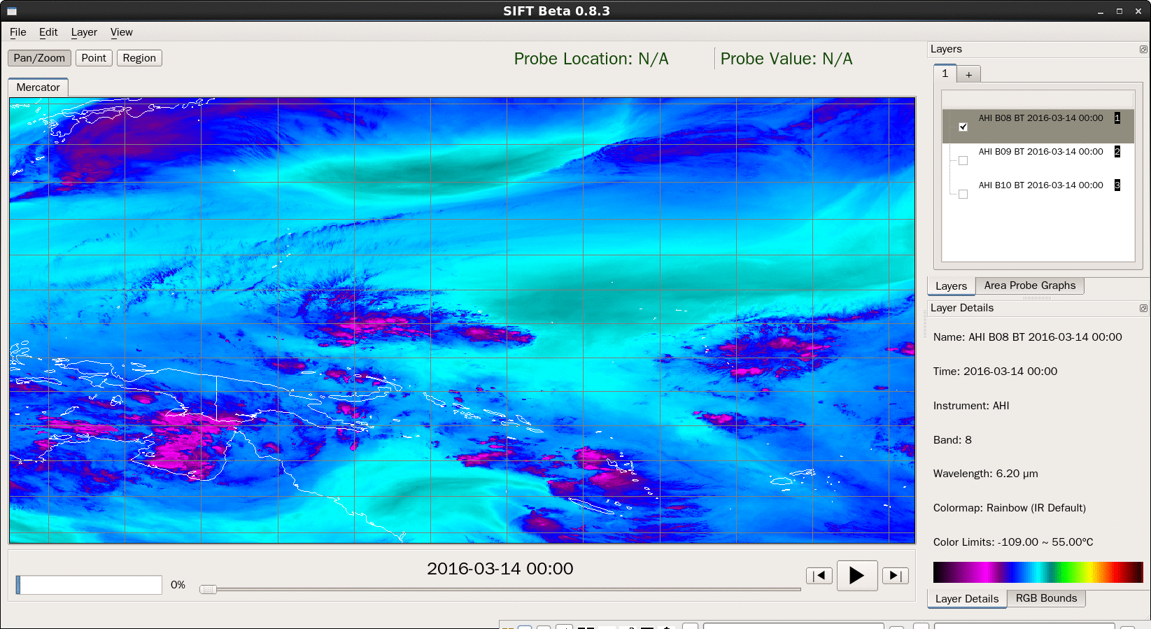
AHI data from Bands 8-10 (6.2 µm, 6.9 µm and 7.3 µm), 0000 UTC on 14 March 2016 (Click to enlarge)
You can also choose a region to investigate by clicking on the ‘Region’ tab:
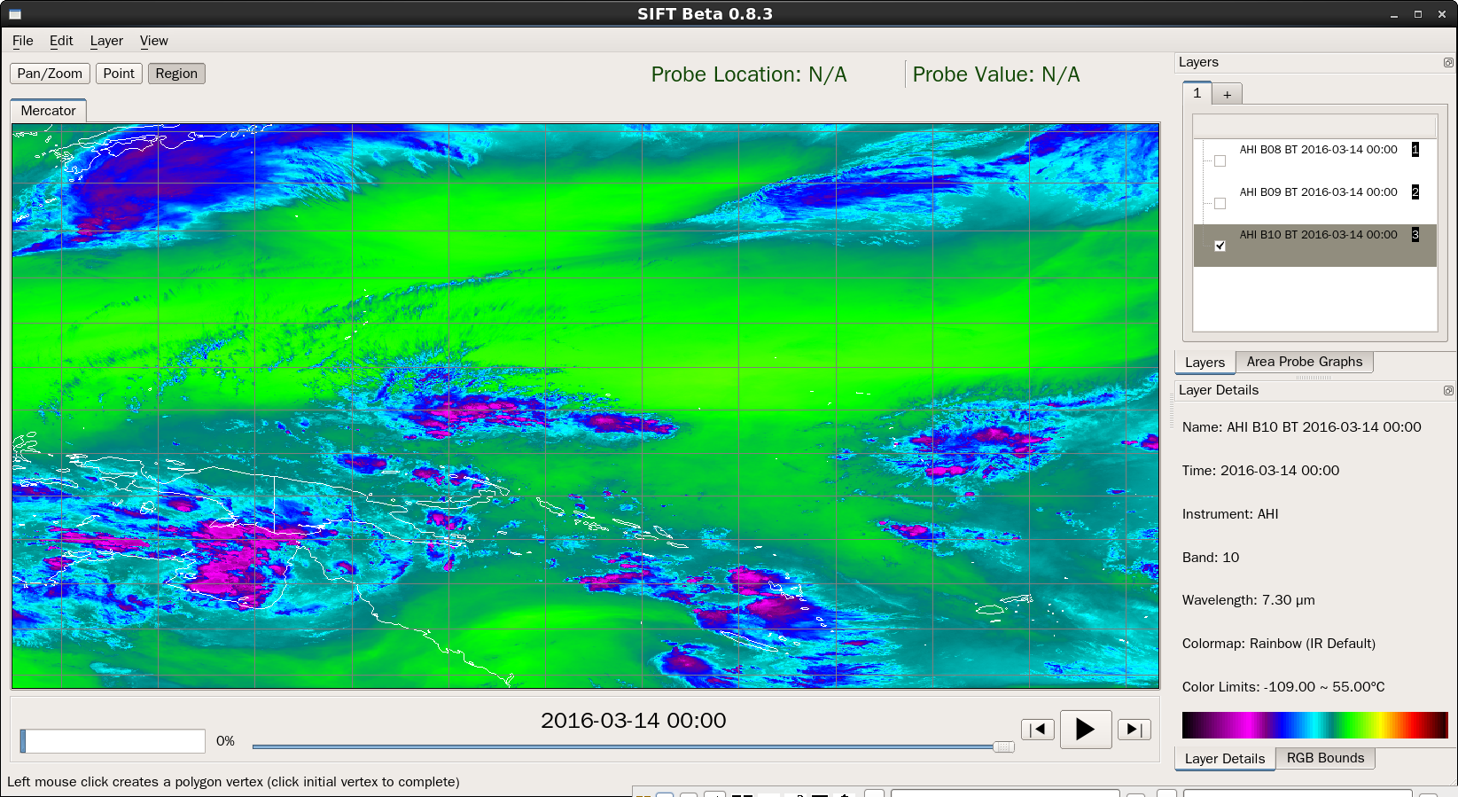
Then, choose your region of interest by left-clicking on points, before finally closing the polygon by left-clicking on the original point:
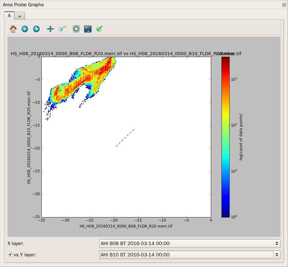
Now, make the Area Probe Graphs visible by clicking on the tab to the right of the main SIFT display window.
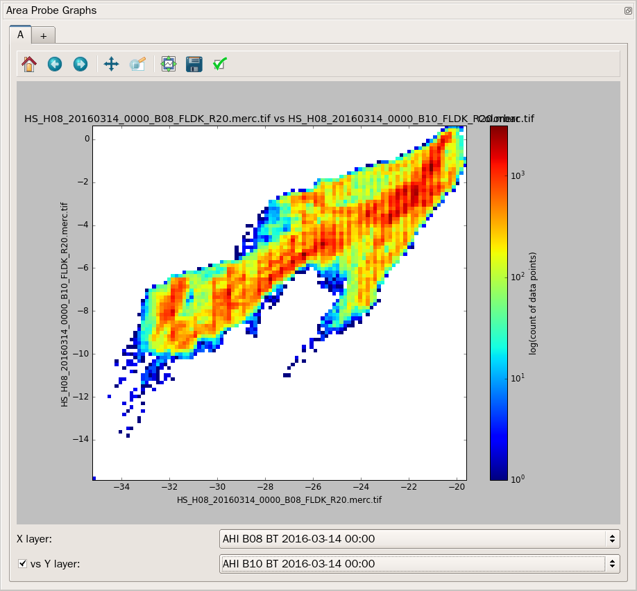
Double-click on the top of the Area Probe Graphs tool bar to pop the graph out of the main SIFT Display — making the graph much larger. Now we can see the density diagram. Note how Brightness Temperatures from Band 10 (the y-axis) are uniformly warmer than Brightness Temperatures from Band 8 (the x-axis). It is possible to edit the axis values, in which case the warmth of the 7.3 µm channel becomes even more apparent (Link to image).
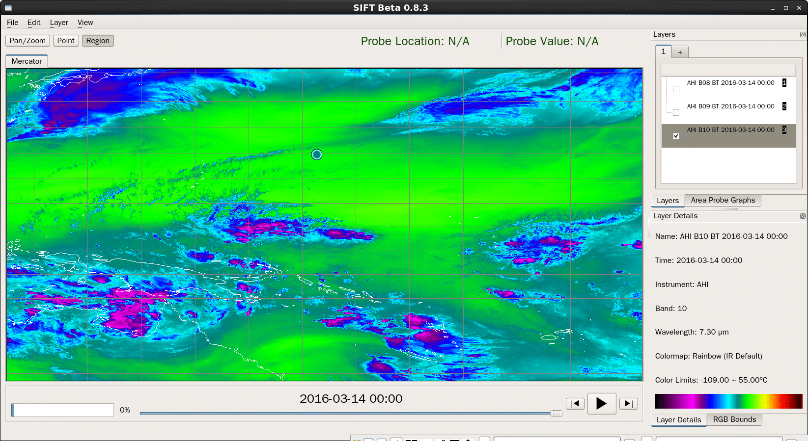
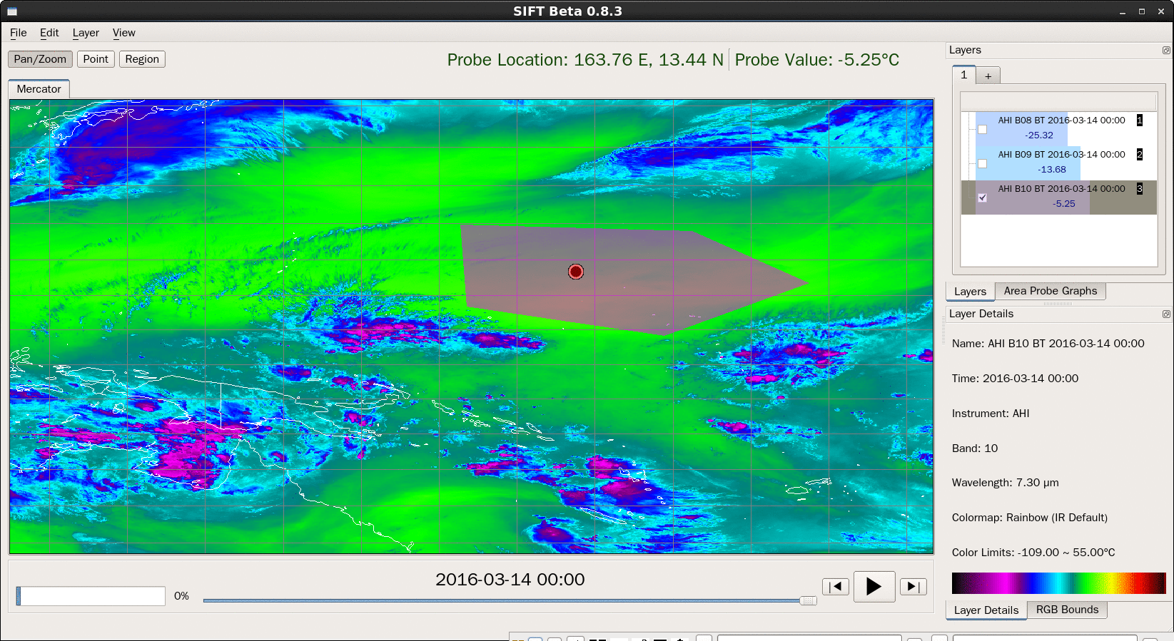
If you right-click on the image in the SIFT window, then data are probed at that point, as shown below. If the ‘Layers’ window is present, horizontal bar graphs are shown for each band loaded with the bar length proportional to the temperature (or, for visible/near-IR channels, the reflectance). If the Area Probe Graph window is visible, the location off the probe site is noted in the scatterplot/density diagram.
Comments